

10 Must-Have Curtain Colors That’ll Brighten Up Your Space (Wait Until You See #4!)
Whether you’ve just moved into a new home or are giving your space a long-overdue refresh, the right curtains can work wonders. They don’t just frame your windows—they set the tone, complement your decor, and dramatically influence how light fills a room. Choosing the right curtain color is one of the simplest, most effective ways to inject life, personality, and brightness into your living space.
So if you’re ready to ditch the dull and embrace the vibrant, you’re in the right place. We’ve rounded up ten must-have curtain colors that will instantly brighten up your home, from timeless classics to bold, unexpected shades. And trust us—you’ll definitely want to stick around for #4.
1. Crisp White – Clean, Classic, and Bright
There’s a reason white curtains are a staple in interior design—they’re like a breath of fresh air for your room. White is synonymous with cleanliness, simplicity, and light. It reflects natural light beautifully, making rooms feel more open and airy.
White curtains also pair well with virtually any color scheme, from minimal monochromes to cozy earth tones or colorful eclectic spaces. If you’re unsure where to begin, white is a safe and stylish bet.
For added dimension, consider white linen or sheer curtains that allow sunlight to filter through. They add a soft, glowing effect that can transform even the darkest corner into a warm, welcoming nook.
2. Sunshine Yellow – A Burst of Joy
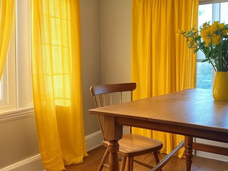
Yellow is the color of happiness, and it absolutely lives up to its reputation when it comes to curtains. A cheerful yellow can infuse your room with a sense of optimism and energy. It’s especially effective in spaces where natural light is limited—like a north-facing room or an apartment with small windows.
From buttery pastels to bright canary yellow, there’s a shade for every taste. Pair yellow curtains with neutral walls and wooden furniture for a fresh, sunny vibe. They work beautifully in kitchens, playrooms, and even home offices, where a little extra motivation doesn’t hurt.
If you’re nervous about going full yellow, opt for patterned curtains that incorporate yellow elements—florals, geometric shapes, or abstract prints. You’ll get all the brightness without overwhelming the room.
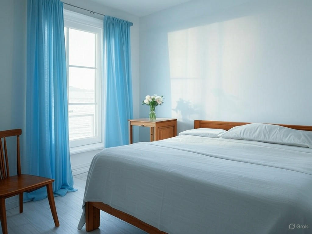
3. Sky Blue – Calm and Uplifting
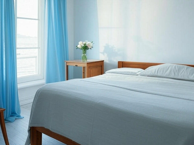
There’s something inherently calming about the color blue, especially when it mimics the sky. Sky blue curtains can open up a room, much like looking out a window to a clear, cloudless day. This shade is perfect for creating a tranquil, peaceful vibe—ideal for bedrooms, bathrooms, and reading nooks.
Sky blue curtains bring a cool freshness that balances well with warm wood tones or crisp white walls. They’re also a great option if you’re leaning toward a coastal or cottage-style aesthetic.
Bonus tip: Try layering sky blue sheers over white blinds or shades for a soft, cloud-like effect that feels light as air.
4. Coral – Unexpected and Absolutely Stunning
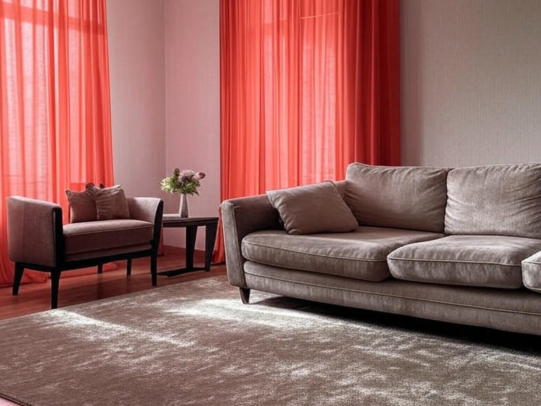
This is the one we couldn’t wait to tell you about. Coral is one of the most underrated curtain colors—but when used right, it can completely transform a space. Somewhere between pink and orange, coral brings warmth, vibrancy, and a touch of playfulness.
Coral curtains work wonders in living rooms, nurseries, or anywhere you want a pop of personality. They’re bold enough to make a statement but still sophisticated, especially when paired with navy blue, gray, or gold accents.
This color particularly shines in rooms with lots of natural light, where it reflects a beautiful, rosy glow across the space. Once you try coral, you’ll wonder why you didn’t do it sooner.
5. Emerald Green – Rich and Refreshing
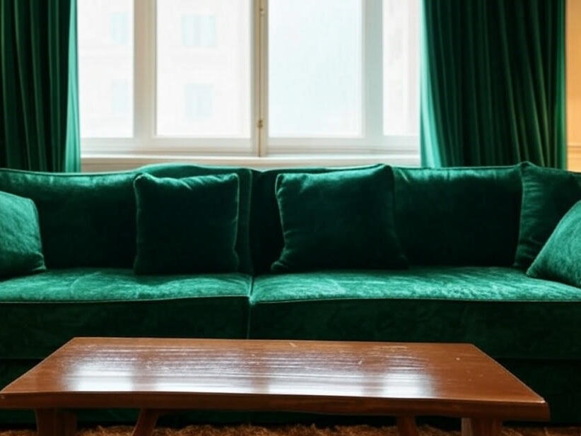
Green is the color of life, and emerald green takes that idea to the next level. It’s lush, elegant, and surprisingly versatile. Emerald green curtains add a rich, luxurious feel to any room while still bringing a natural sense of vitality and freshness.
This color works especially well in living rooms and bedrooms. When paired with gold or brass accents, emerald green curtains create a glam, high-end look. Or, pair them with rustic wood and woven textures for a grounded, nature-inspired vibe.
If you’re into the popular “grandmillennial” style—a mix of traditional elegance and modern flair—emerald green might be your new favorite curtain color.
6. Soft Gray – Subtle Sophistication
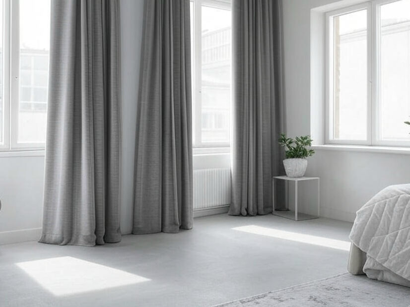
For those who love a more understated look but still want to brighten their space, soft gray curtains are a fantastic option. They offer a refined, minimalist feel and pair effortlessly with nearly any interior style—Scandinavian, modern farmhouse, industrial, or transitional.
Soft gray doesn’t demand attention, but it contributes to a calm, polished atmosphere. It reflects light better than darker grays and provides a nice contrast to white walls without feeling stark.
Look for lightweight fabrics like linen or voile to keep the look fresh and airy. You can also try ombré styles that blend soft gray into white for a gentle gradient effect.
7. Blush Pink – Romantic and Light-Enhancing
Blush pink isn’t just for kids’ rooms anymore. It’s elegant, soft, and full of charm. Blush pink curtains add warmth and femininity without overwhelming the space. Think more modern elegance, less bubblegum Barbie.
This color looks stunning in bedrooms, dressing areas, or cozy reading corners. Blush pink pairs well with white, ivory, gold, and even darker hues like charcoal or navy for contrast.
If you’re trying to brighten your space while keeping things warm and romantic, blush pink is a dreamy choice. It works especially well with brass curtain rods and vintage-style decor.
8. Lavender – Soft, Serene, and a Little Magical
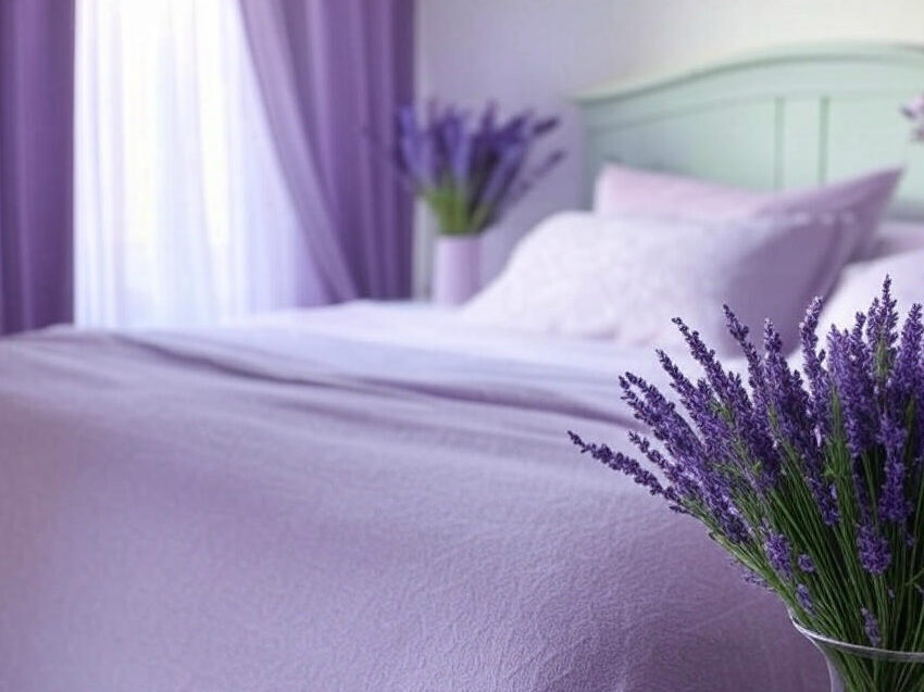
Lavender curtains bring a whimsical, soothing quality to any room. This light purple shade is often associated with relaxation, making it perfect for bedrooms, meditation spaces, or anywhere you want to wind down.
Lavender plays beautifully with other pastels—mint, blush, baby blue—or neutrals like white and beige. It adds just enough color to be interesting without overpowering a space.
To enhance the calming effect, choose flowing, sheer lavender fabrics that allow light to softly diffuse through the room. The result? A space that feels both serene and a touch enchanted.
9. Burnt Orange – Earthy and Energizing
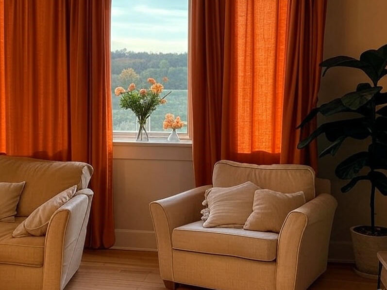
If you’re looking for a warm, cozy vibe with a hint of spice, burnt orange curtains are the way to go. They’re vibrant yet grounded, making them perfect for fall-themed interiors, boho styles, or earthy, rustic spaces.
Burnt orange adds personality and color while still maintaining a sense of balance. It pairs beautifully with deep greens, navy blues, and warm neutrals like beige or tan. This shade is also fantastic for creating contrast in rooms with a lot of light wood or white walls.
Whether you go for solid burnt orange or a patterned curtain with hints of the shade, the effect is always inviting and bold.
10. Beige with Gold Accents – Understated Glam
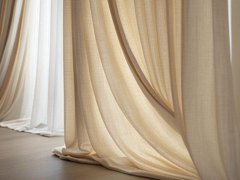
Last but not least, beige curtains with subtle gold accents offer a touch of elegance and warmth without being too flashy. They’re ideal for those who want a little sparkle without committing to bold colors.
The beige base keeps things neutral and light, while the gold details—think metallic threads, embroidery, or printed patterns—catch the light and add dimension.
These curtains are incredibly versatile. They work in formal dining rooms, upscale living areas, or even bedrooms with a soft, glam vibe. You get all the brightness of a light neutral with just enough shimmer to make things special.
Conclusion: Light Up Your Life with the Right Curtains
There you have it—ten curtain colors that don’t just hang around your windows, but elevate your entire space. Whether you want something bold like coral or calming like sky blue, the perfect curtains can make all the difference.
Remember, curtains aren’t just a functional necessity—they’re a design opportunity. They affect how light flows into your room, how spacious it feels, and even how cozy or energetic the atmosphere becomes. Don’t be afraid to experiment with color. Start with one room, one set of curtains, and see how it transforms the vibe.
And hey, if all else fails—go with #4. Coral’s got your back.


0 Comment